
Any device, any size
Responsive web platforms allow websites to adapt to screens of all sizes, regardless which device is used to connect.
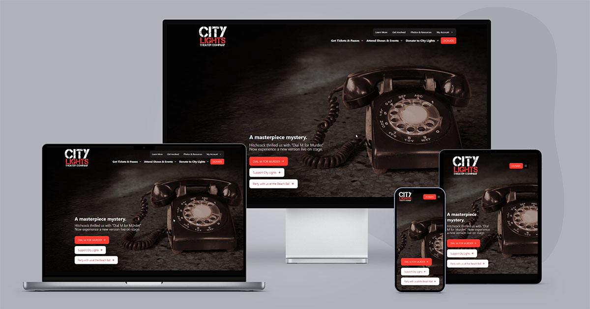
Responsive design doesn’t play favorites so it won’t matter if the device is made by Apple, Google, or who-knows-what, the end results look great.
Flexible images and fluid grids then size correctly to fit the screen. In some cases, you can even filter out which content areas are displayed or change the display interface entirely. All of this happens in real-time in fluid, smooth transitions.
The images and content column will shrink, then the sidebar will disappear altogether.
When doing the same thing on UpStage’s homepage, you’ll see the layout shrink from three columns, to two columns, to a singular column of content.
Stay Ahead Of The Tech Curve
Before responsive design came along, if companies wanted to have an optimal mobile experience of their website a separate set of templates or a device-specific app had to be designed and developed.
Every time a new device comes out those costs continue to go up, there’s no benefit from advances in technology because you have to make another website or app specific to that device.
One website, all devices.
That means that your website only has to be developed once, with a mobile first strategy, significantly reducing the cost.
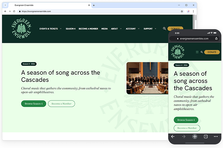
Your Site Will Be Relevant Longer
When adopting responsive design supported by our updates for life support, your site will stand the test of time for longer.
The fact that you can have the ability to design your site in one project and manage from a single control panel will also free up your time.
Less meetings, less keeping track of variations for the same content, and less wondering if you’re just going to have to do this process all over again once a new device comes on the market.
Instead of playing catch up, you’ll stay ahead of the curve.
Your website will be Future-Proof!
Increase Conversion And Earn More Revenue
When people visit your site, they are more likely to take action if they have a good experience.
Finding what they are after without a frustrating click-click-click or tap-tap-tap process that forces one new page load after another just to get to a point where they can finally begin the shopping cart process is crucial.
Responsive design with mobile first strategy will greatly improve user experience in all devices and getting them what they need with less frustration means increased conversions and higher sales!
Imagine the surprise on other arts organization’s faces when they see how user friendly and intuitive your site has become.